Cryptocurrency Movement Over Time
Apr 12, 2019・4 min read
tl;dr — we visualized cryptocurrency movements between popular wallets
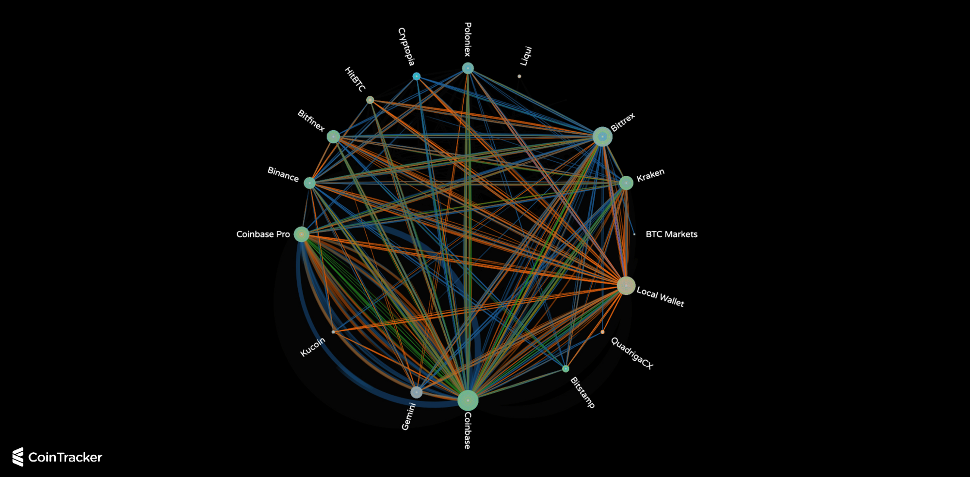
At CoinTracker, we are building the most trusted tax and portfolio manager for cryptocurrency. As part of this effort, users from 146 countries have synced their crypto wallets to monitor their portfolios. As a by-product of this effort, we have been able to make some interesting observations about the aggregate flows of cryptocurrencies over time (individual user data is completely private on CoinTracker — privacy policy, security policy).
We pulled the anonymized & aggregated dataset, worked with the world-renowned firm Stamen to visualize it, and now we would like to share it with the community.
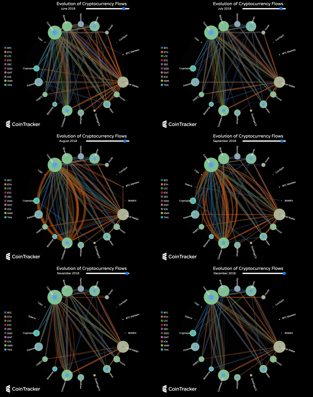
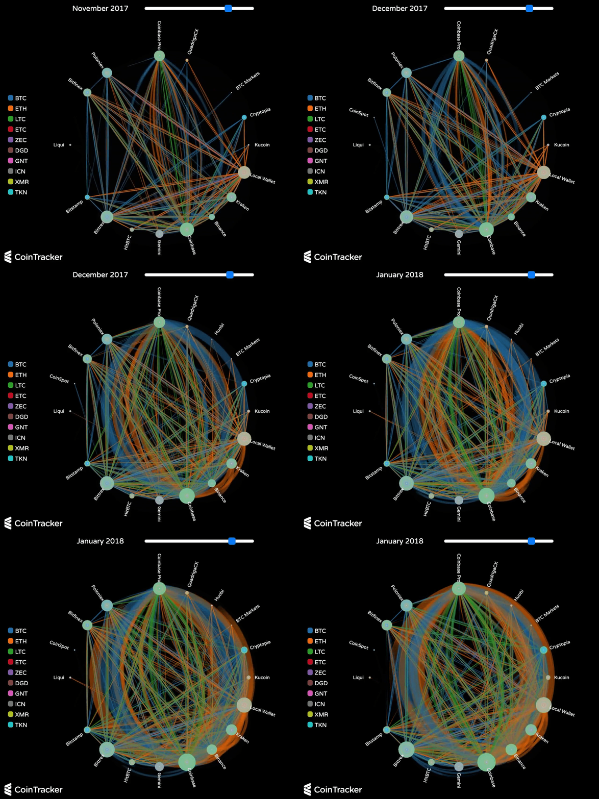
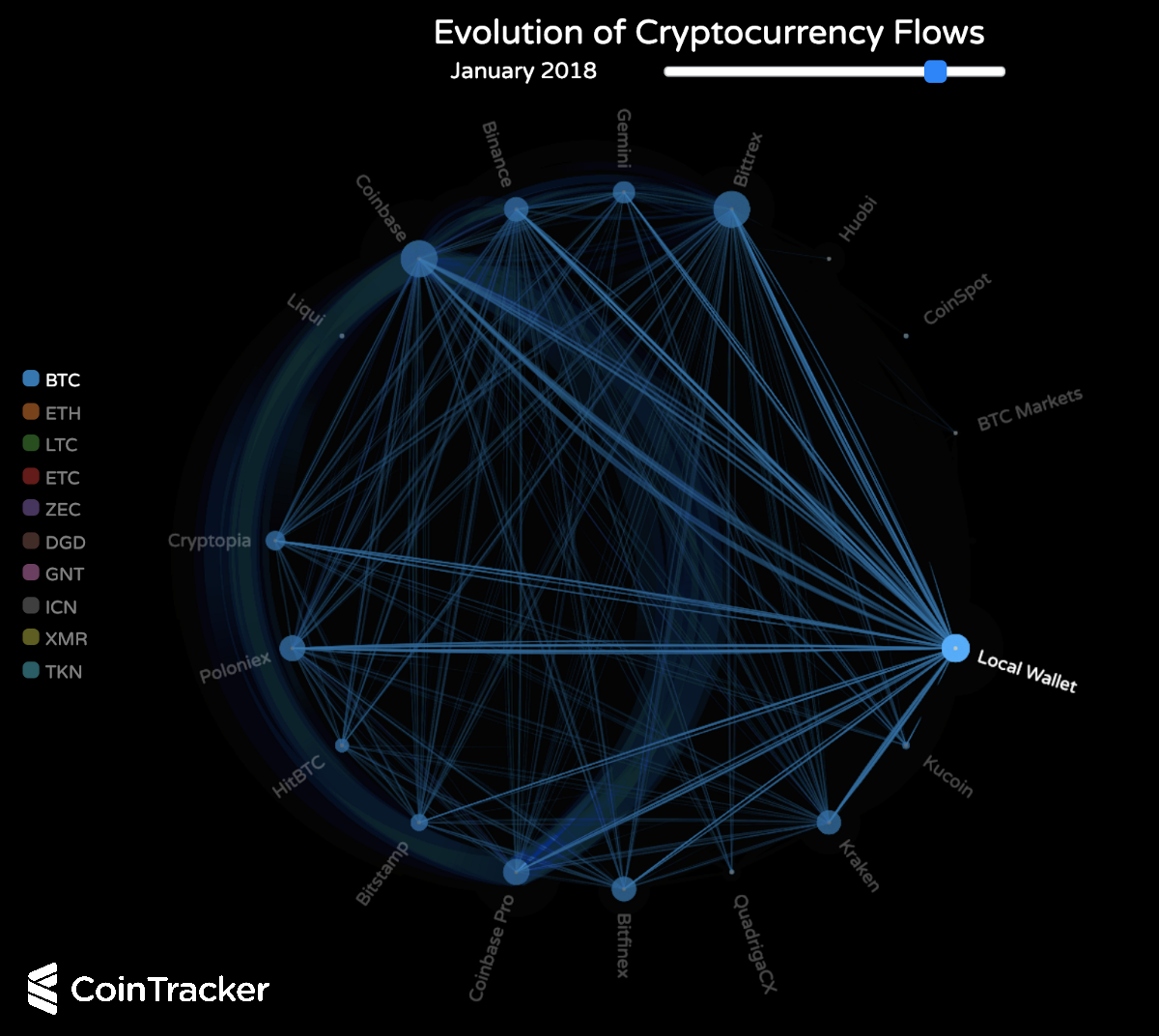
Specifically, the visualization shows the movements of digital currency flows between popular wallets for some of the top coins over the last five years. Each node on the graph represents a cryptocurrency exchange (or local wallet). The edges represent the flow of funds transferring between the wallets, with the color indicating the coin and the thickness indicating the volume of transfers. The size of the nodes changes with aggregate transfer volume from a selected start date forward. You can filter coins by selecting/un-selecting coins in the legend, drag the slider to pick a particular time, and hover over a specific node to isolate the activity in and out of that wallet.
Some caveats:
- The data set is across ~50,000 users
- The data is biased to users who track their cryptocurrency on CoinTracker
- There may be some errors from users who manually edited transactions indicating a wallet supported a particular coin before it actually did
Here are some patterns we have noticed in the data:
1) Price as a leading indicator for transfers
December 2017 brought the peak prices in cryptocurrency history (to date). The following month, January 2018, had the greatest inter-exchange crypto activity in blockchain history. This suggests that cryptocurrency prices are a leading indicator of cryptocurrency transferring between exchanges to take advantage of the skyrocketing volatility.
2) Bitcoin vs. Ethereum
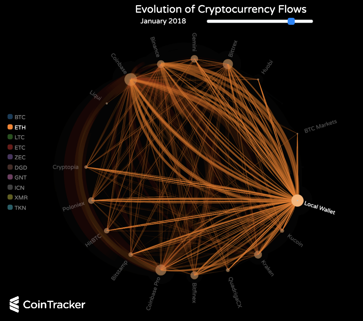
The patterns of bitcoin and ether flows during the price peak in December 2017 — January 2018 are quite different. While ether has a large net outflux from local wallets (into exchanges, especially Coinbase and Binance), bitcoin had a net influx into local wallets (from exchanges). This suggests that crypto-holders at the price peak of the bull run were more eager to trade ether and more likely to HODL bitcoin. One possible explanation for this is a change in the popularity of Ethereum maximalism (Web 3.0) vs. Bitcoin maximalism (digital store of value).
3) The rise of Binance and Coinbase
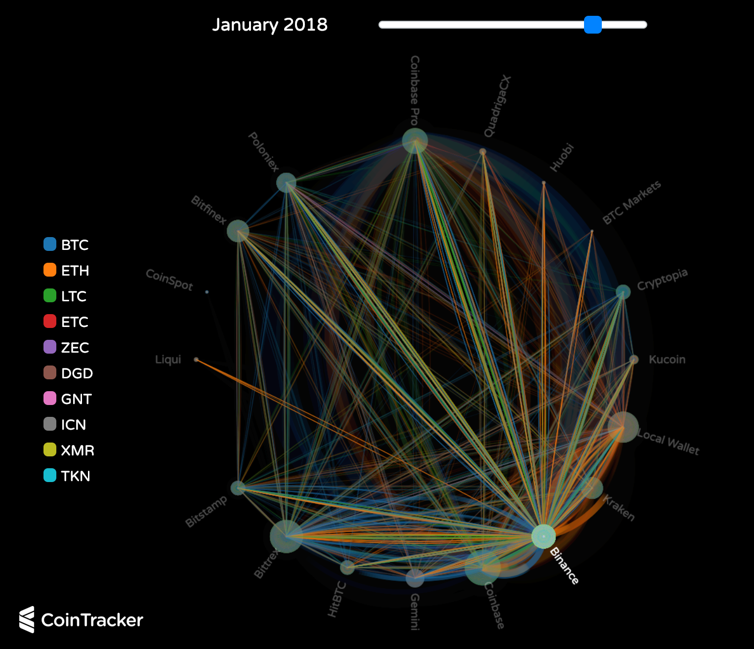
The largest nodes at the end of the visualization (if you start from the beginning) are Coinbase, Binance, and Local Wallets. This depicts the lead that Coinbase and Binance have developed. In the case of Coinbase, it is a steady rise over time. In the case of Binance, it is a meteoric expansion starting in August 2017. At the peak of the cryptocurrency market capitalization, you can see:
- Crypto transfers from Coinbase to Binance for those users looking to get into altcoin trading (for pairs supported on Binance but not on Coinbase)
- Transfers from Binance to local wallets for users securing their funds with their own private keys
- Outflows of crypto from most other altcoin crypto exchanges to Binance as it grows in market share
4) Privacy coins
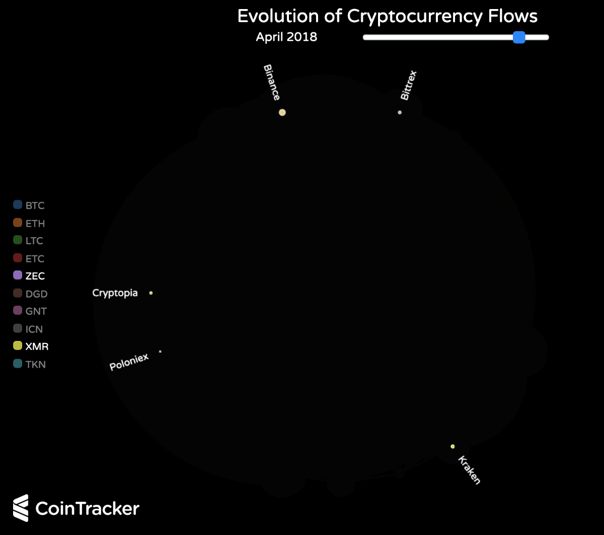
Privacy coins are moved between exchanges much less than non-privacy coins. There is clearly less incentivize for users to move these coins from one exchange to the next if they are trying to maintain their privacy. Note: these data are biased by the fact that privacy coin local wallets are not tracked
We look forward to hearing from you — the cryptocurrency community — about what interesting trends you see in the data and what new visualizations you would like to see next. Tweet @CoinTracker and let us know!
Excited about the project or learning more about CoinTracker? We're hiring.